Role & Responsibilities
UI/UX Designer
>Research
>Competitor Analysis
>Prototyping
>UX Design
Team
2 Designers
1 Supervisor
Duration
2 mo.
Tools
Figma
Adobe Illustrator
Problem
Users download plant apps to help manage their plants' health, but end up dropping the app due to ineffectiveness or an inability to integrate the app's use into their routine.
Solution
Let's design an app that takes the work out of plant care by making it easy to use, enjoyable, and actually effective at maintaining long term plant health.
01 Empathize & Define
The first most important question we needed to ask is who are we designing for?
Understanding Our Users
We asked relevant questions regarding our potential users, use case scenarios, and user needs.

After discussing and evaluating our ideas, we narrowed down our main user groups.
Busy Individuals
What often makes plant care difficult is how to fit this into an established routine, whether that be a 9-5 job or full time school.
Frequent Travelers
Our app should give users the peace of mind to go on vacations and trips without the worry of coming back to dying plants.
The Newbie & The Expert
Not all plant parents have the same level of knowledge. This should be an ideal plant care app for any users on the spectrum of beginner to experienced.
User Persona
To keep our user requirements in mind, we utilized a user persona to reference during our design process.
Referencing a persona helps reinforce that we are not the user and it was an important reminder for us to remember that individual experiences do not reflect the broader user base.

Our App should allow Sara to take care of her plants in the easiest and the most intuitive way possible thanks to taking full advantage of Planto’s watering sensor*.
*the watering sensor was a pre-determined component of this design challenge
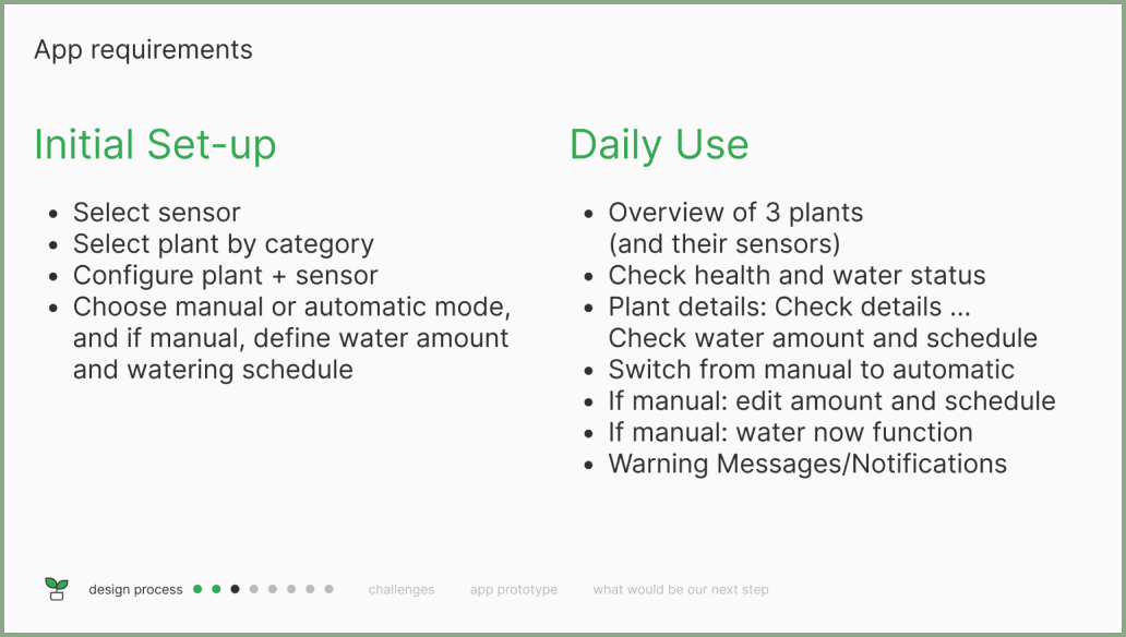
App Requirements
Considering the functions of the watering sensor and our user needs, we outlined requirements for the app and separated these into two categories for the initial user set-up and the user's daily use.
Design Guidelines
We revised our initial guiding statement to be more specific in terms of user needs:

With our revised guiding statement in mind, we created a list of specific guidelines to follow and UX principles to focus on.
02 Research
Competitor Analysis
To inform our design process and understand our users, we question and observe.
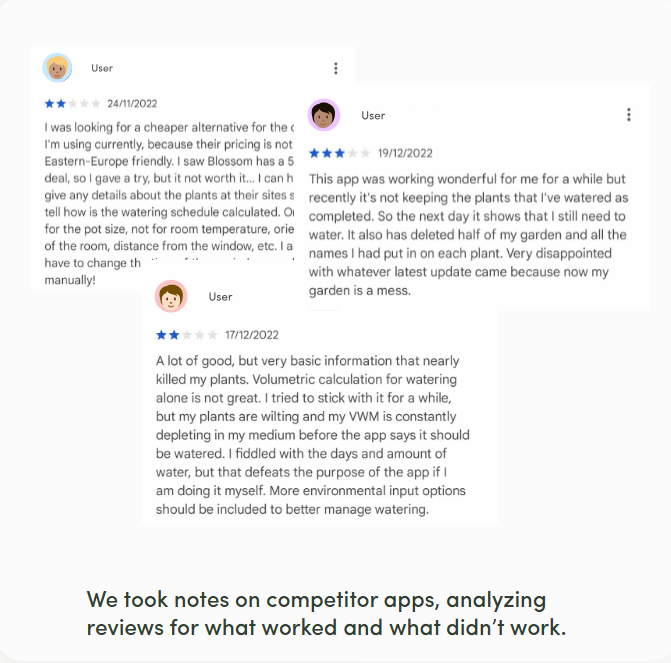
When analyzing competitor apps, we kept the following questions in mind.
>What features aren’t so user friendly?
>What is already on the market and what do they offer?
>What features are positively received?
>What do people wish to see?
Benchmarking
We then tested the apps ourselves, noting down what we liked, didn't like, as well as
ideas we considered already and hadn't considered yet.
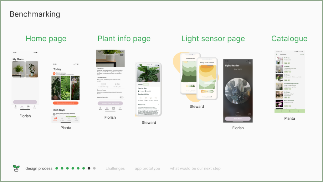
We noted down elements we especially liked to build off of and implement in our own design.
Light Sensor
Although the light sensor was not a specified requirement in our app guidelines, we chose to include this because light and water are the two most important aspects of plant care. Excluding this option might have also lead to excluding less experienced plant owners who are unaware of light requirements.
Camera Function
Looking at how plant apps used the camera to identify plants, we also got the idea to use this for our initial set up. Using the camera to configure the sensor to the app would allow for easy setup and minimize user frustration.
Plant Catalog
Using a catalog as an additional option to searching for the plant ID portion of the set up would allow us to meet the expectations of users and give them some control to choose the way that is easier for them.
03 Ideate > Build
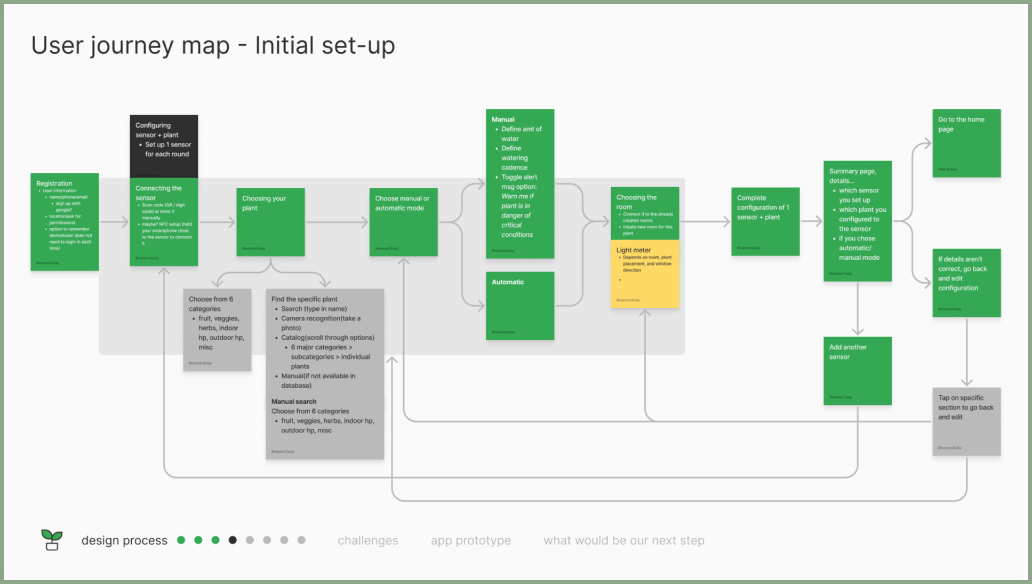
User Journey Mapping
We built two user journey maps. One for the user's initial set up,
and another for the user's daily use.

As we created our user journey maps, we kept in mind feedback from user reviews, as well as insights from peers who shared their own experiences and frustrations as plant owners, in addition to our own experiences.
This kept us from creating too many steps in the set up process and to keep the map as simple as possible to accomplish the task.
User Interface Sketches
We sketched out ideas of how our interface should look like.

We sketched out ideas of how our interface should look like.
As we created our user journey maps, we kept in mind feedback from user reviews, as well as insights from peers who shared their own experiences and frustrations as plant owners, in addition to our own experiences.
This kept us from creating too many steps in the set up process and to keep the map as simple as possible to accomplish the task.
UI Design
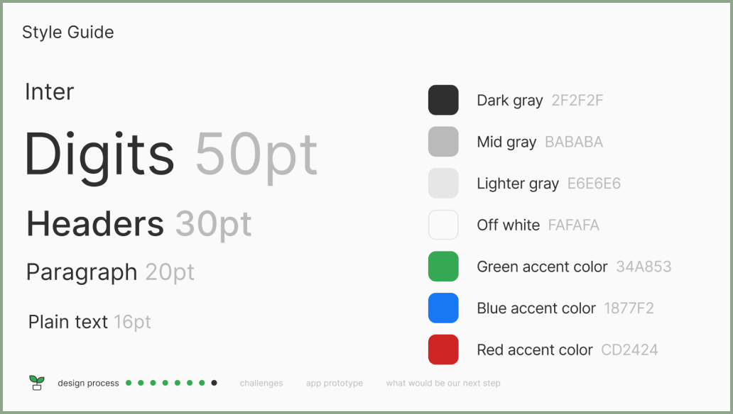
To keep our design elements consistent, we built a style guide to reference while creating our UI.
Prototyping
With a good foundation, we started with Lo-Fi prototypes,
then cycled between testing, revising, and evaluating,
before we built our final prototype.
Final Product Reflections
What worked well in our design
Navigation Design
We really focused on minimizing any navigation confusion by ensuring that the user was able to intuitively navigate from start to end, and that they understood where they were in the process at all times.
Feedback
Part of minimizing user confusion and uncertainty was making sure that there was feedback from the app for every action they took, so as to make sure they understood which actions created which outcome.
Flexibility
Minimizing user frustration was key in our design and one way we emphasized this was to give the right amount of control to the users. They had the flexibility to choose which set up methods worked best for them, instead of forcing a particular method.
Things I would do differently
User Testing
The most important part of UX design is testing and although we tested amongst ourselves, our supervisor, and peers, I would focus on testing for our specific target group using methods such as A/B testing to get a more accurate understanding of how our prototype performs.
Brand Design
Although our focus was on the UX portion of this project, I would also spend more time developing the brand design of the app in order to create a unique identity that the user could connect with on a personal level, especially for long term use.


