Genetically Modified Foods

Engaging & Interactive Informational Exhibit for Youth

An educational interface designed to help young children make informed decisions about their food consumption
Role & Responsibilities
UI/UX Designer
>Research & Benchmarking
>SME Interview
>Prototyping
>Interaction Design
Team
2 Designers
1 Supervisor
Duration
3 mo.
Tools
Figma
Adobe Illustrator
Teachable Machine
Our prompt was to design an interactive exhibit utilizing data visualization and communicative systems for knowledge transfer in the context of exhibitions and museums.
With our topic of Genetically Modified Foods (GMOs) in mind, we combined the two to create our guiding question:
How can we effectively design an interface to educate users on the topic of GMOs in the context of a exhibition?

01 Inform (Initial Research)

Before deciding how we should inform a target audience, the first most important step we needed to take was to inform ourselves about GMOs.

We asked ourselves, what do we already know and what do we need to know?

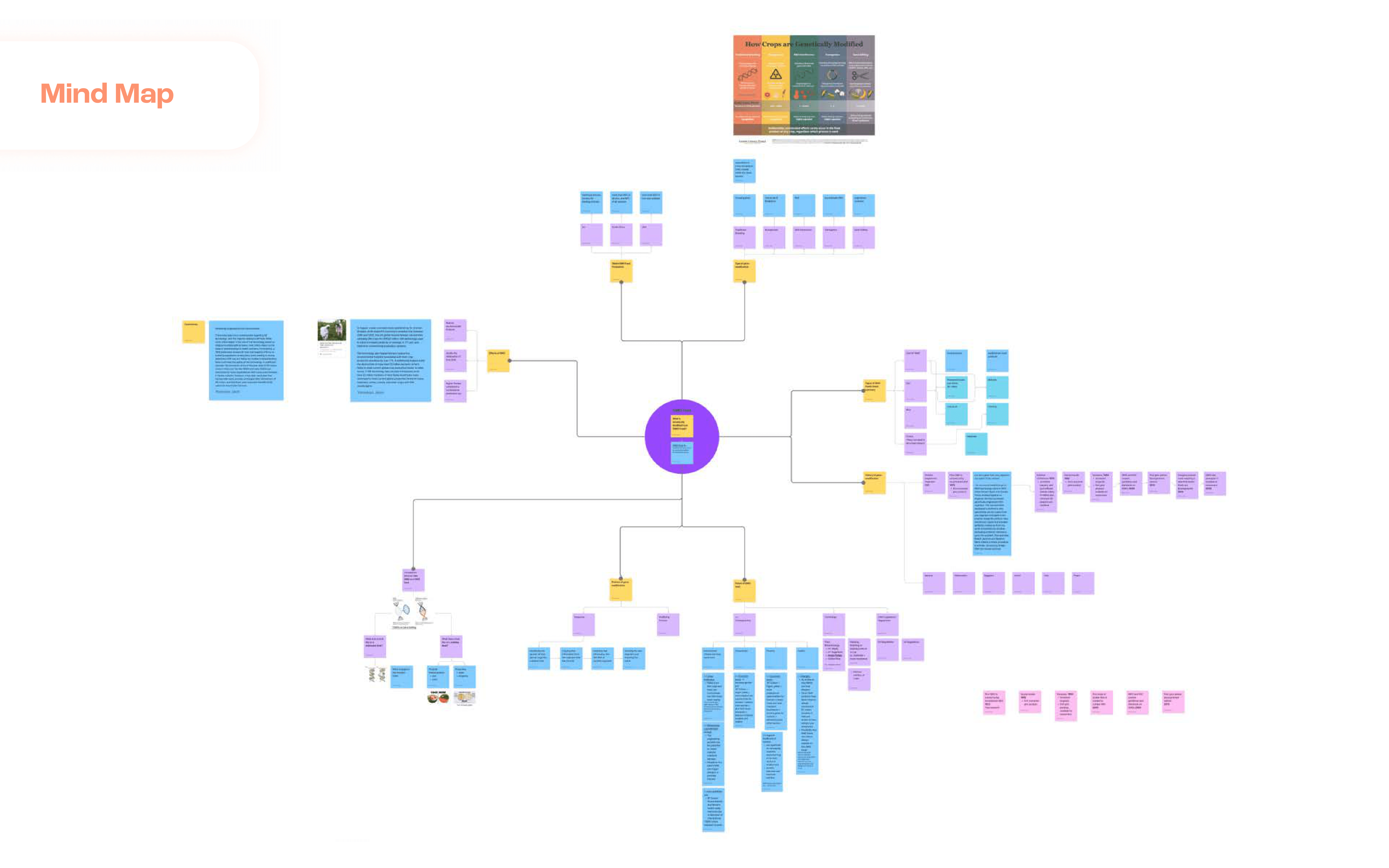
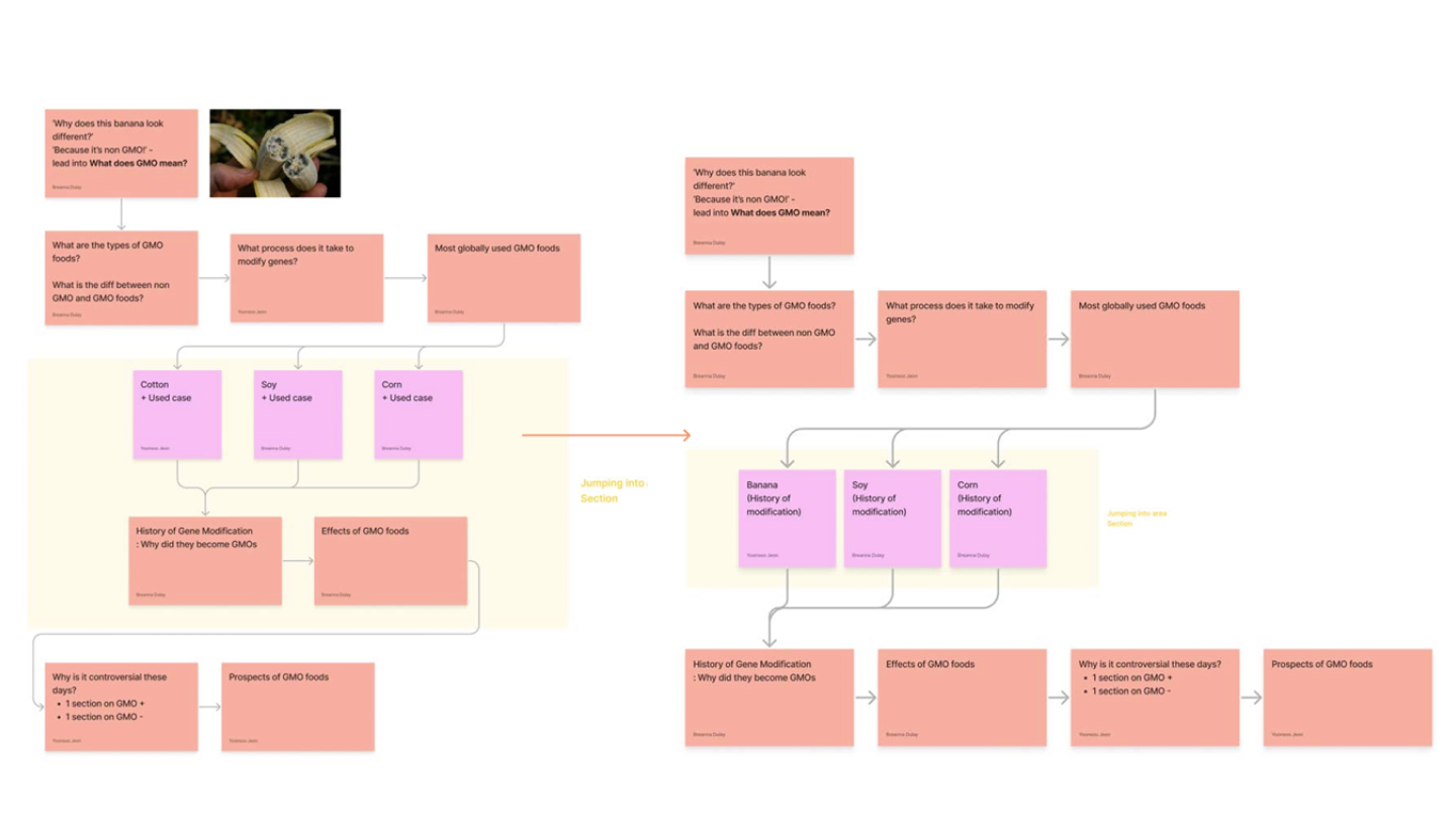
To answer these questions we started by creating a mind map to understand what areas of GMOs we need to delve into.
We then assigned each other to specific areas of our topic to conduct research individually and then come together to share our findings.

Interview

Together, we generated potential interview questions we could ask a subject matter expert.
After determining the most important questions, I reached out to a previous professor of mine as a firsthand source, who specialized in nutrition, to gain deeper insights about GMOs through a virtual interview.
Insights gained from this interview helped spark new areas of GMOs to explore, including future prospects, which became a main subject area within our content.

Organizing our research

We categorized our research into main sections and subsections.
This method allowed us to organize the information we gathered into their respective sections efficiently, which also made the visualization process much easier.

02 Define

Target Group

We decided our target group would consist of younger students from primary school to high school, as we found a lot of potential to share our information in a engaging manner, just as students may expect in school.
We then determined three key elements to emphasize in order to design with our users in mind.
Information Organization
We needed to block our information into chunks that would fit the attention span of school age children (on average approximately 5-10min).
Interaction Design
Maintaining key touchpoints of interaction would keep our users engaged enough to follow through with the application.
Visual Style
When determining our visual style, we needed to create a style guide with visual elements that were friendly, bright, and engaging.

Context of Use

We determined two main use cases where our interface would be successful in.
Science Museum
The most fitting environment would be in a science museum. Science museums such as Exploratorium have hosted many unique and engaging exhibitions while being extremely informative.
The majority of attendees are children which would also fit into our target audience.
Farmer's Market
Our exhibit could also be hosted at a farmer’s market, where families often visit together.
People are there to buy their food, but could also be enticed to learn about the food they are buying and have them think more consciously about their purchase and consumption.
There are often informational stands at farmer’s markets, but without the degree of engagement that our exhibit could offer.

Our Communication Goals

How can we present information in a concise and compelling manner?
Identify a clear storyline
It should be easy for our users to navigate from beginning to end.
Design an engaging user interface.
Allow multiple chances for users to interact with the application in order to move it forward.
Make it an intuitive experience
Our application should behave consistently with users’ expectations and reinforce their mental model.

Storyline

We used Aristotle’s 7 elements of good storytelling to structure our narrative and manner of presentation.

03 Design Research

Benchmarking

Our first part of benchmarking was to search for and collect interesting interactions in existing food-related museum exhibitions. This gave us an idea of what was already existing and similar to our ideas, as well as sparked ideas for physical and digital user interactions.
For our second round of benchmarking, we looked at colorful infographics and noted visual elements we liked and wanted to use for our UI illustrations, like cross-sections of fruit.

04 Ideation

Information Architecture

Initially we wrote a linear storyline, but we found the need to put a section for users to jump around so they can freely navigate to specific sections of information they are interested in.
Following our second revision, we rearranged a few sections and combined other sections to make for a more concise storyline.
The final version of our information architecture involved just minor revisions.
These included swapping the order of a few sections and the addition of the GMO Mini Game.

Storyboarding

To visualize our narrative and potential interaction points, we sketched out a storyboard for sections of our application.
Storyboarding helped us figure out how users should progress through the storyline and also brought new and interesting ideas for potential user interactions.

Interaction Points

We took notes of the types of real life physical interactions we could translate as digital interactions in our interface to present our information in a interactive way and to make our storyline more engaging.
This also guided us on which direction to take for our illustrations and motion graphics.
We brainstormed ideas for engaging interactions that would prompt the user to move forward with the application.
One idea we especially like was the cross-breeding mini game since the intent of the game was to enable users to think
more deeply about GMOs as they navigate through the interactive portion.

Exhibition Method

I sketched out ideas for what an ideal exhibition would look like, and then adjusted based on factors of
Usability
Does this environment invite users to engage and is it the starting interaction point clear?
Resources
Do we have access to the resources to build this type of environment?
Time
Could we realistically build this environment considering the deadline and our limited knowledge?

Graphic Design

To create a consistent visual style and keeping in mind the feelings we wanted to evoke with our graphics, we collected ideas that fit this ideal and created a mood board to reference when creating our style guide and illustrations.

User Interface

Using our established visual guidelines and completed elements, we progressed from a LoFi screen to a HiFI screen.

05 Prototyping

Wireframing

We actually started with prototyping our wireframes prior to completing our UI and found this easier
as we had more flexibility to experiment with specific prototyping actions.

Hi-Fi Prototyping

Physical Prototyping

For the first portion of our physical prototype, we were able to cut our physical interaction cards to the exact size of our illustrations on our screen by exporting our digital illustrator placards into a pdf for the laser cutter.

These placards were important as a tactile interaction point for users to navigate through an important section of information, as opposed to just swiping to get to the next screen.
Once we had our interactive placards, we needed to merge our physical interactions with the navigation of our digital application.
we we used a keytapper.js script to work with a recognition model we trained with Teachable Machine.

First, we trained a camera recognition model using Teachable Machine.
This involved taking multiple pictures of each placard, uploading them to Teachable Machine, and categorizing them.
We then needed to connect our trained model to the transition buttons in Figma.
Using a keytapper.js script, we configured the transition keys to be "pressed" and navigate to the specific section when the camera recognized a specific placard.
The configuration itself needed a lot of fine tuning.
Sometimes the camera didn't recognize the placard or the wrong transition was mapped to the wrong key, so there was a lot of retraining and revisions made in between steps.

06 Testing

Exhibition Set Up

On exhibition day, we set up our components:
1) Camera on a tripod adjusted to view the display
2) Our main interaction point: touch screen display
3) Placards placed for easy access
4) Our description board for more information

Observation

Once we set up, we stood by and observed users navigate through our prototype.
Throughout the day, we noticed what worked, namely,
Physical-Digital Interaction
The use of physical placards to navigate through a specific section was a pleasant surprise for many users and initiated interest.
Emphasis on User Input
Including multiple interaction points for users to navigate through the prototype kept them engaged throughout.
UI Navigation
Most users were able to navigate from beginning to end without any outside help.
We also took of note of what could've worked better,
Camera Recognition
There were a few cases where the camera was not able to recognize the placard on the first try which caused some user confusion.
Prototype Glitches
There were also a few cases where we needed to restart the prototype for a user because they swiped to navigate to the next page, but no transition occurred.
Lack of Auditory Feedback
With a select amount of users, there was a moment where it seemed like they were listening for any sound from our display, though they were able to continue when they confirmed there was no sound output.

Final Product

Project Video

Reflection

Post-exhibition, I reflected on our observations and took note of what the next iteration of this project would need to improve and focus on.
Accessibility
Noticing users look for sound feedback made me think about what kinds of users wouldn't be able to navigate through the prototype.
User Testing
Conducting more user tests prior to the exhibition might have allowed us to fix any hiccups regarding camera recognition and navigation much earlier.
Inclusion of User Group
One aspect to note is that although our target group was young children, our project was exhibited at a university austellung so the majority of our users were within the university age range or much older adults.